How to Keep Cartoon Character Colors Consistent in AI Image Generation
A practical guide to keeping cartoon character colors stable in AI image generation with small palettes, HSB language, prompt references, and visual comparison habits.
AI image generators are great at style, composition, and surprise. You can ask for a playful mascot, a comic-style portrait, or a sticker character, and the first result may look polished within seconds.
But cartoon color consistency is harder.
A character might keep the same face and pose while the body color shifts from warm yellow to pale cream. A red jacket may become orange. A blue background may turn teal. These changes can feel small, but for cartoon-style characters they matter. Color is part of the character's identity.
You do not need professional design software to improve this. You need a small palette, clearer prompt language, and better review habits.
Why Cartoon Colors Drift in AI-Generated Images
Most prompts describe the subject first: a cheerful cartoon character, a cute animal mascot, or a sticker-style avatar. Color often appears as a short phrase near the end: blue jacket, yellow body, red shoes.
That may work for one image, but it is usually too vague for repeatable results. Words like blue, yellow, and red cover a wide range of possible colors. A blue jacket could be navy, cyan, denim, or muted gray-blue. If the prompt does not define the color relationships, the model has room to reinterpret the palette.
Lighting also changes perceived color. A warm sunset can make white look yellow and red look orange. A cinematic shadow can make a bright blue shirt look darker and less saturated. Style presets can have the same effect.
This is why regenerating the same prompt can preserve the character shape but alter the color design.
Start with a Small Character Color Palette
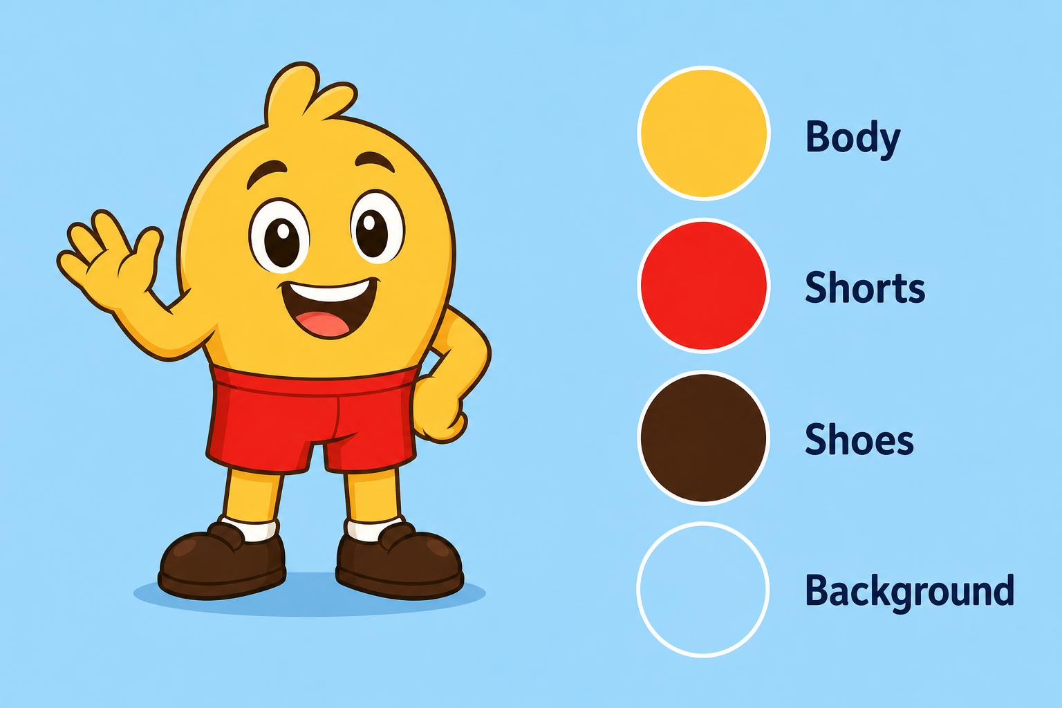
Before writing the full prompt, decide which colors matter most. For many cartoon characters, three to five colors are enough:
- The main body, skin, or fur color
- A clothing color
- One accent color
- A shoe, hair, or accessory color
- A simple background color
The key is to assign each color to a specific part of the character. Do not just write "bright colorful cartoon character." Instead, create a compact palette in plain language.
For example:
- Body: warm yellow
- Shorts: saturated red
- Shoes: dark brown
- Background: soft sky blue
This gives the AI model a stronger structure. The color is no longer floating in the prompt. It belongs to a specific object.
If you are working on a character across multiple images, keep this palette visible while you generate. A screenshot, a note, or a row of color swatches is enough.
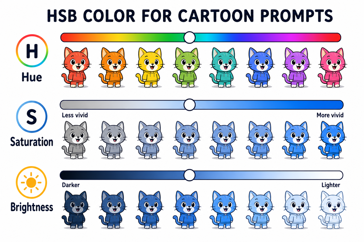
Use HSB Language Instead of Only Color Names
For better color control, think in HSB: hue, saturation, and brightness.
Hue is the color family. Is it yellow, green, blue, red, or purple?
Saturation is the intensity. Is the color vivid and strong, or muted and gray?
Brightness is how light or dark the color feels.
HSB matches how non-designers usually talk about color corrections. You may not know the exact RGB value, but you can tell when a jacket is too dull or a yellow body has become too orange.
When reviewing a generated cartoon image, ask: is the hue wrong, is the color too dull, or is it too bright? This mental model helps even if you never type exact color codes.
For example, "make the jacket less saturated" is clearer than "make the blue better."
Add Color References Directly into Your Prompt
Once you have a small palette, write it into the prompt in a structured way. A good pattern is:
A clean cartoon character illustration with a warm yellow body, saturated red shorts,
dark brown shoes, and a soft blue background. Keep the same color palette across the image.
Flat cartoon shading, crisp outline, no realistic lighting.
Notice that each color is tied to a body part or scene element.
Also notice what the prompt avoids. It does not stack vague words like colorful, vibrant, magical, cinematic, glowing, and dramatic all at once. Those words can be useful for mood, but they also invite the model to change saturation and brightness.
If color accuracy matters, ask for flat cartoon shading. Realistic lighting often creates highlights, shadows, and color casts that make the palette harder to preserve.
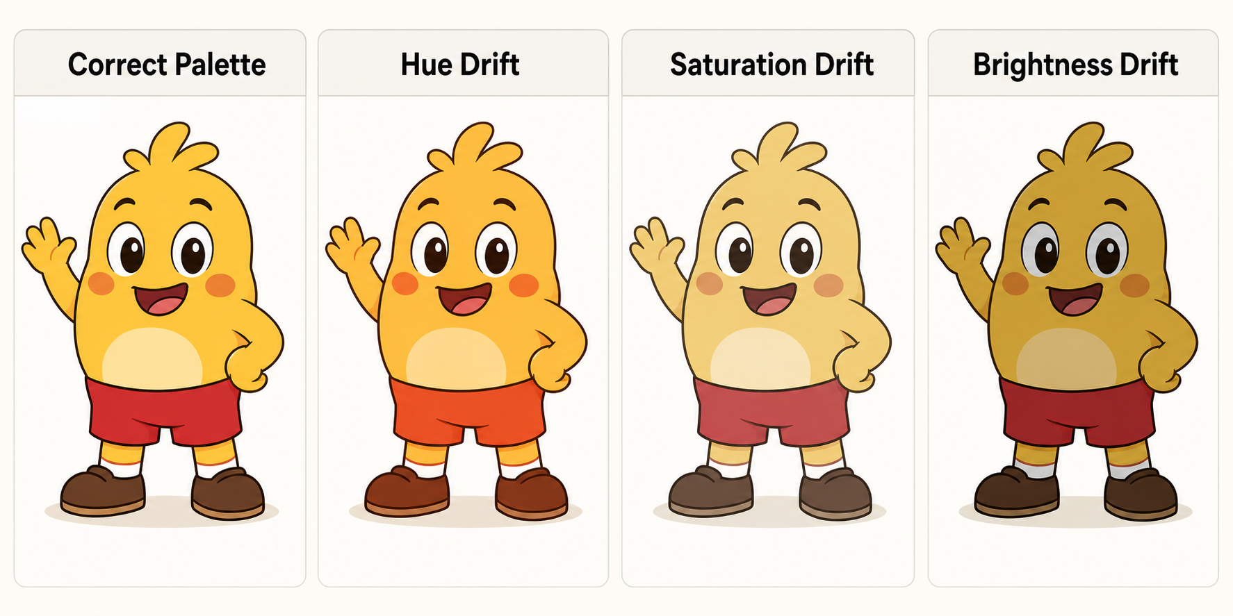
Compare the Result by Eye Before Regenerating
Many people regenerate too quickly. They see that the result is not quite right, click again, and hope the next one will be better.
Before regenerating, pause and identify what actually changed:
- Is the hue wrong?
- Is the saturation too strong or too weak?
- Is the brightness too light or too dark?
These questions turn a vague complaint into a prompt revision. Instead of "try again," write "keep the shorts red, not orange," or "make the blue background lighter but not more saturated."
If you want to train your eye for these small differences, try this free cartoon color guessing game before writing your next prompt. It uses HSB sliders to help you notice hue, saturation, and brightness changes in familiar cartoon-style characters.
The more you notice small shifts, the easier it becomes to write useful correction prompts.
Use Variation Prompts to Lock the Palette
After you get one image with a good character design, use that image as your anchor. If your AI image tool supports image references, upload the best result as the next reference. Then ask for new poses or scenes while keeping the palette fixed.
Useful phrases include:
- Same character color palette
- Do not change clothing colors
- Preserve the yellow body and red shorts
- Flat lighting, no strong color cast
Here is a simple variation prompt:
Create a new pose for the same cartoon character. Preserve the warm yellow body,
saturated red shorts, dark brown shoes, and soft blue background. Use flat cartoon
shading with no strong color cast. Do not change the clothing colors.
This separates the change you want from the parts that must stay stable.
Common Mistakes to Avoid
The most common mistake is using only broad color words. "Blue outfit" is not wrong, but it is too open-ended if you need consistency. Add intensity and brightness: muted blue jacket, bright sky-blue hoodie, deep navy collar.
Another mistake is letting dramatic lighting override the palette. Golden hour, neon glow, and cinematic shadows can all shift colors. If the palette matters more than mood, keep lighting simple.
Changing style and color instructions at the same time can also cause problems. If you ask for a new art style, pose, background, and more accurate colors in one prompt, it becomes harder to tell which instruction caused the drift.
Finally, review each result as it appears. Small corrections are easier than trying to rescue a palette after many versions.
Quick Checklist for Better Cartoon Color Consistency
- Define three to five key colors before writing the prompt.
- Assign each color to a specific character part or background element.
- Describe hue, saturation, and brightness changes clearly.
- Use flat lighting when color accuracy matters.
- Compare each result before editing the prompt.
- Save the best generation as a visual reference for future variations.
Conclusion
Consistent cartoon colors come from clearer prompts and better visual review habits. You do not need advanced color theory to improve your results. A small palette and an HSB mindset are enough to make your feedback more precise.
Better AI cartoon images start with better color decisions. Build a small palette, describe it clearly, and review each generation with hue, saturation, and brightness in mind.
Recommended Reading
More Nano Banana Pro guides and workflows you may find useful.
The Virtual Influencer Formula: Keep One Face Consistent
Stop random faces. Use Nano Banana Pro multi-image fusion plus image-to-image workflows to keep one AI character consistent across 100+ photos.
Midjourney Parameters Handbook: 2026 Syntax Update
A practical 2026 handbook for Midjourney parameters, with new syntax additions, parameter combinations, workflow tips, and examples for creators and teams.
Best AI Image Tools in 2026: Ranked & Compared
A practical 2026 ranking of the best AI image generation tools, comparing Midjourney, DALL-E 4, Stable Diffusion, Flux 2, and emerging alternatives with real-world performance benchmarks and workflow recommendations.